雲端發票 (eCloudInvoice) is a mobile application designed to encourage everyone in Taiwan to use electronic invoices. This app aligns perfectly with the Taiwanese Ministry of Finance's vision to cut down on the costs and clutter associated with traditional paper receipts.
Product Designer
2023
In response to the transition towards paperless invoicing, the Taiwanese Ministry of Finance has implemented electronic invoicing as an option. Businesses in Taiwan utilizing electronic invoices provide consumers with the option to store invoices digitally or receive physical electronic invoice proofs. However, an application capable of securely storing and presenting invoices is essential to enable individuals to manage their invoices digitally.
Our application was initially the pioneering electronic invoice solution in Taiwan. However, in recent years, numerous competing applications offering comparable functionality and features have emerged. Consequently, the decline in user engagement has become a significant challenge for our application.
My team and I are committed to enhancing the main functionality of our application to elevate the overall user experience. The first step is to focus on refining our core features to distinguish ourselves from competitors in the market.
The primary functionality of our electronic invoicing system includes the capability to scan individual invoice barcodes for storage and presentation of invoice information to users. Additionally, it features invoice prize verification with the system that automatically scans and notifies users of any winning invoices. In addition, what sets our application apart is its capability to utilize invoice details for comprehensive item analysis. To facilitate this, the application includes a review section where users can search for and submit reviews.
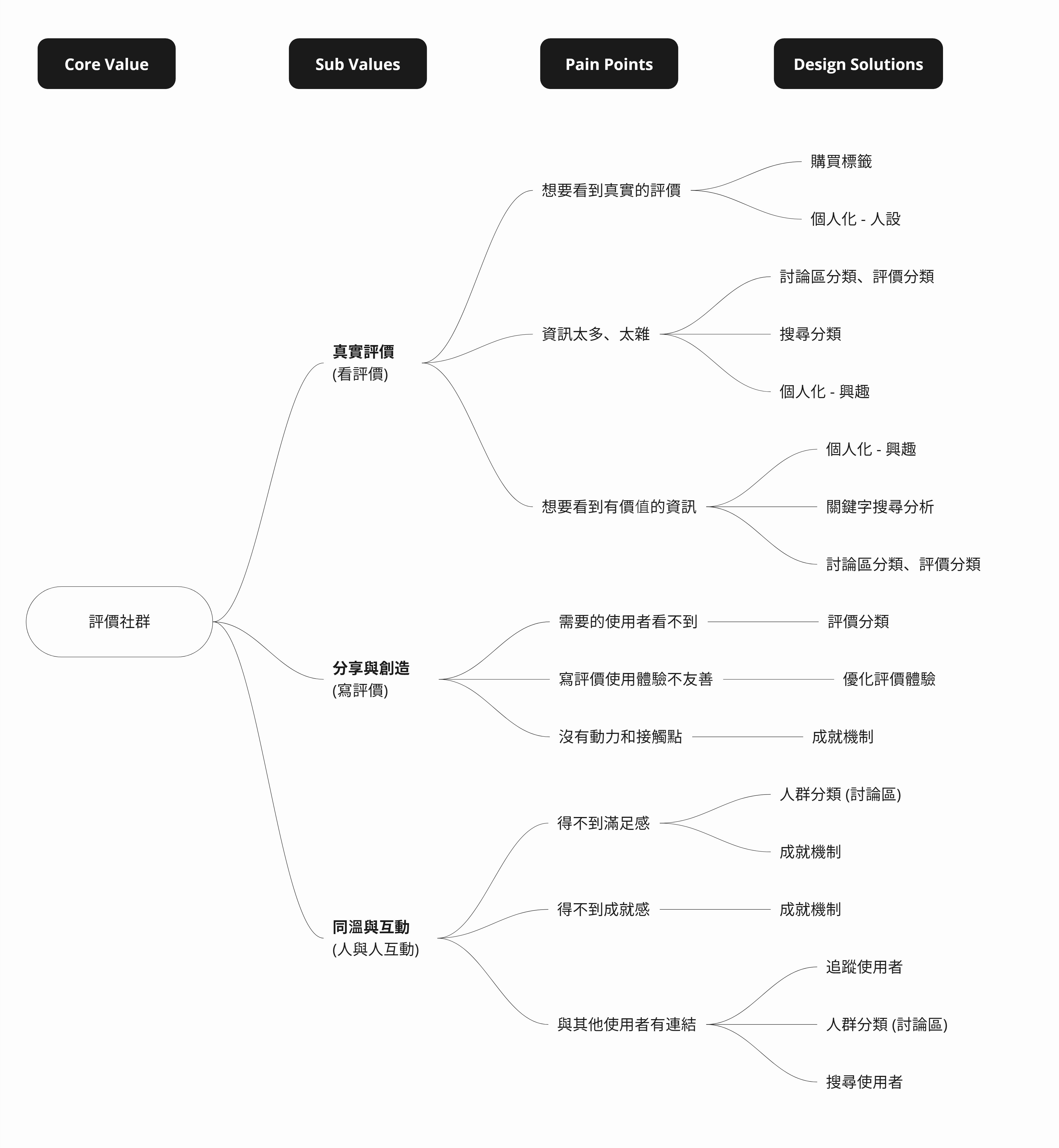
"How Might We"(HMW) is a design thinking method that helps designers reframe problem statements, fostering efficient ideation sessions to tackle design challenges, encompassing the define and ideate stages.
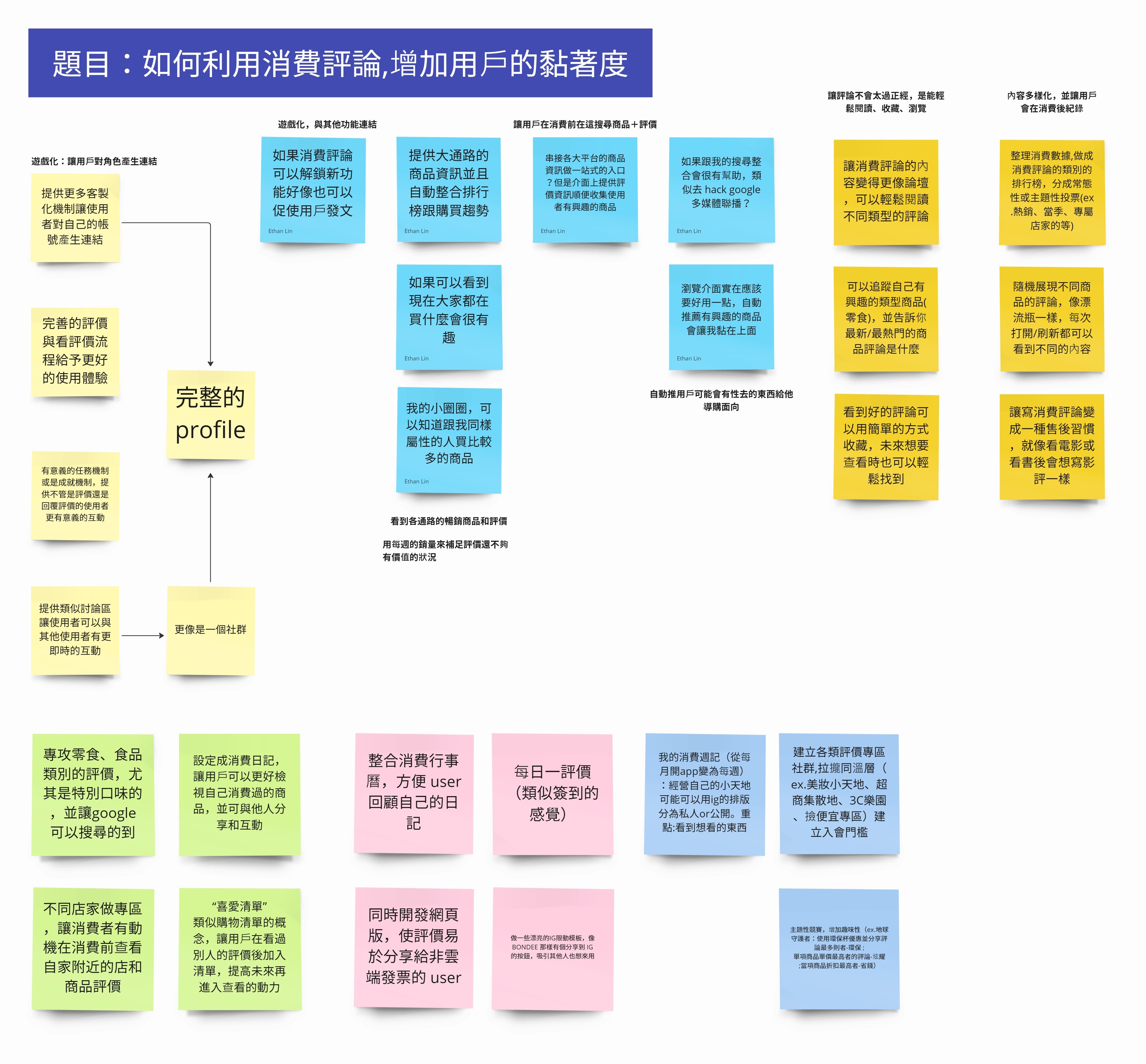
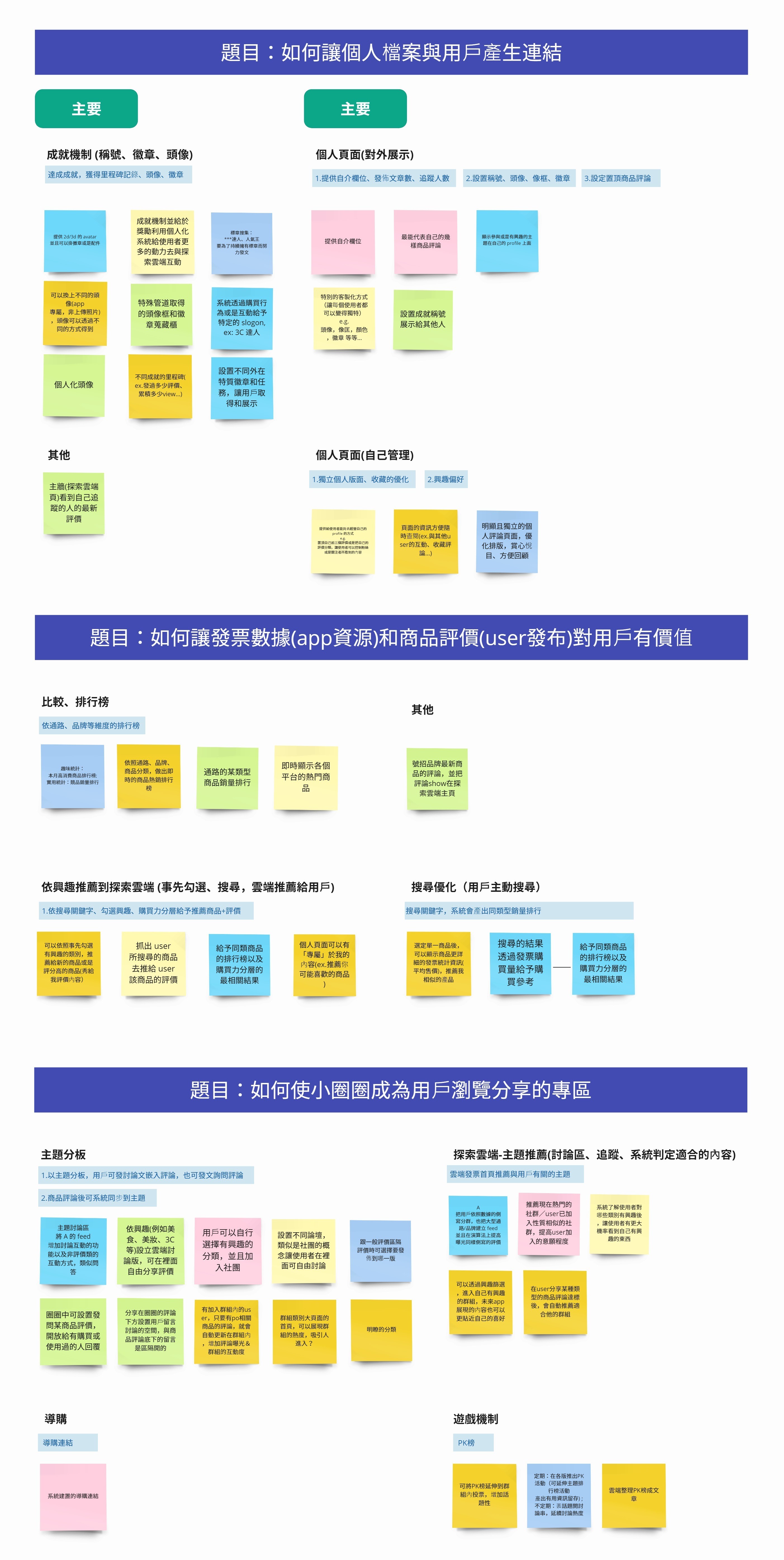
The team came together in an HMW workshop to identify challenges in our current application and explore potential solutions. Throughout the sessions, our focus was on creating positive user engagement and enhancing interactions. Our objective is to increase daily user logins, emphasizing frequent interaction over sporadic usage. The HMW workshop guided us in defining our strategic direction, placing a strong emphasis on cultivating emotional connections and meaningful user experiences within the application.
Initially, the project scope was deemed too extensive to proceed without a thorough analysis of user feedback, posing a significant risk to company revenue. In response, the team prioritized enhancing user engagement as the primary strategy to sustain our user base.
Before we dive into building an emotional connection between the app and the users, we first focused on simplifying the review submission process to see if it would enhance user engagement in our review forum. We noticed that users were struggling with the clarity of the review writing steps, which left them feeling confused during submission.
To enhance user engagement, we designed a theme store that lets users buy and apply different colour themes to customize their app experience. This feature is designed to foster a stronger emotional connection and make the app feel unique to the users.
Finally, our last approach focuses on a comprehensive redesign of the review forum (探索雲端). This decision was made to address the forum’s usability issues and clarify its purpose and goals, which were previously ambiguous. To ensure the redesign effectively meets user needs, our team analyzed contemporary social media and food review apps to better understand user goals and preferences.
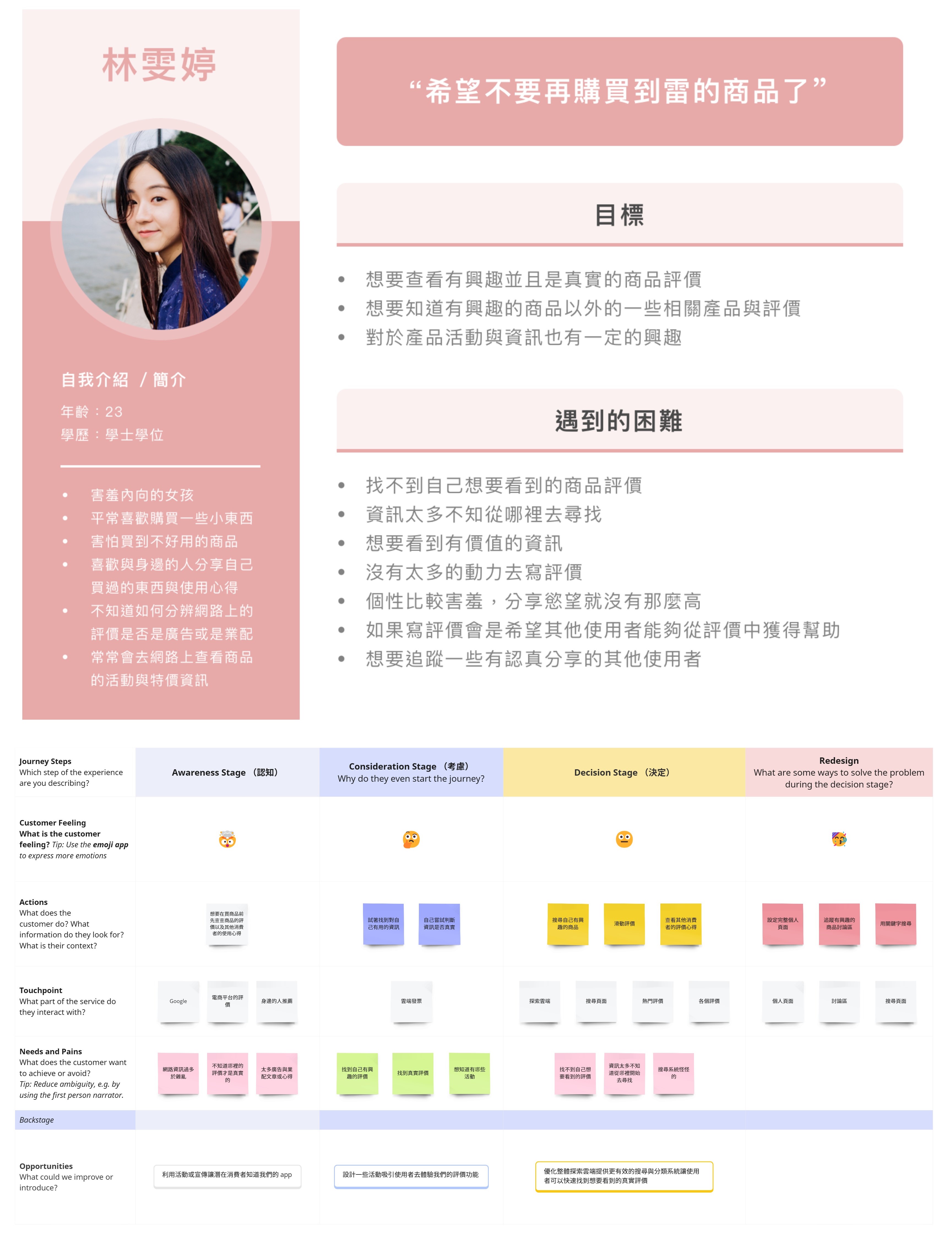
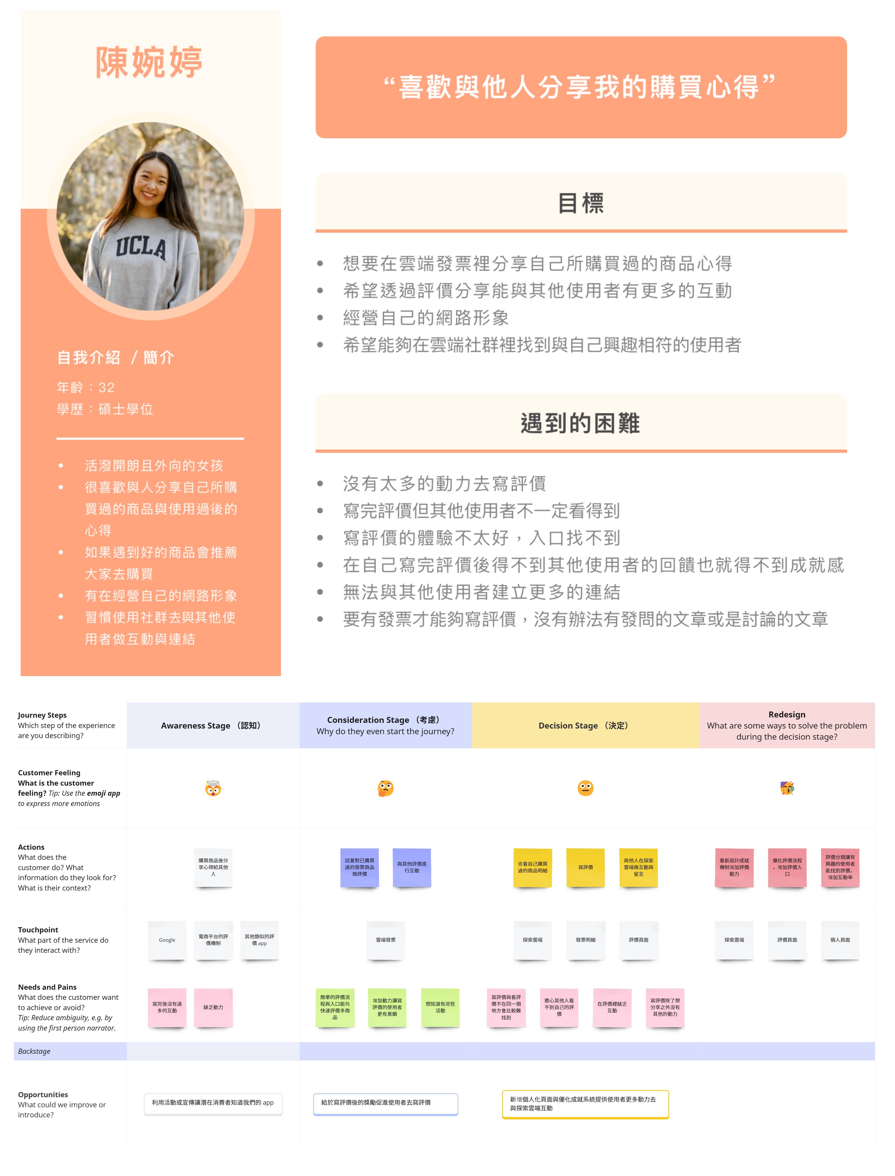
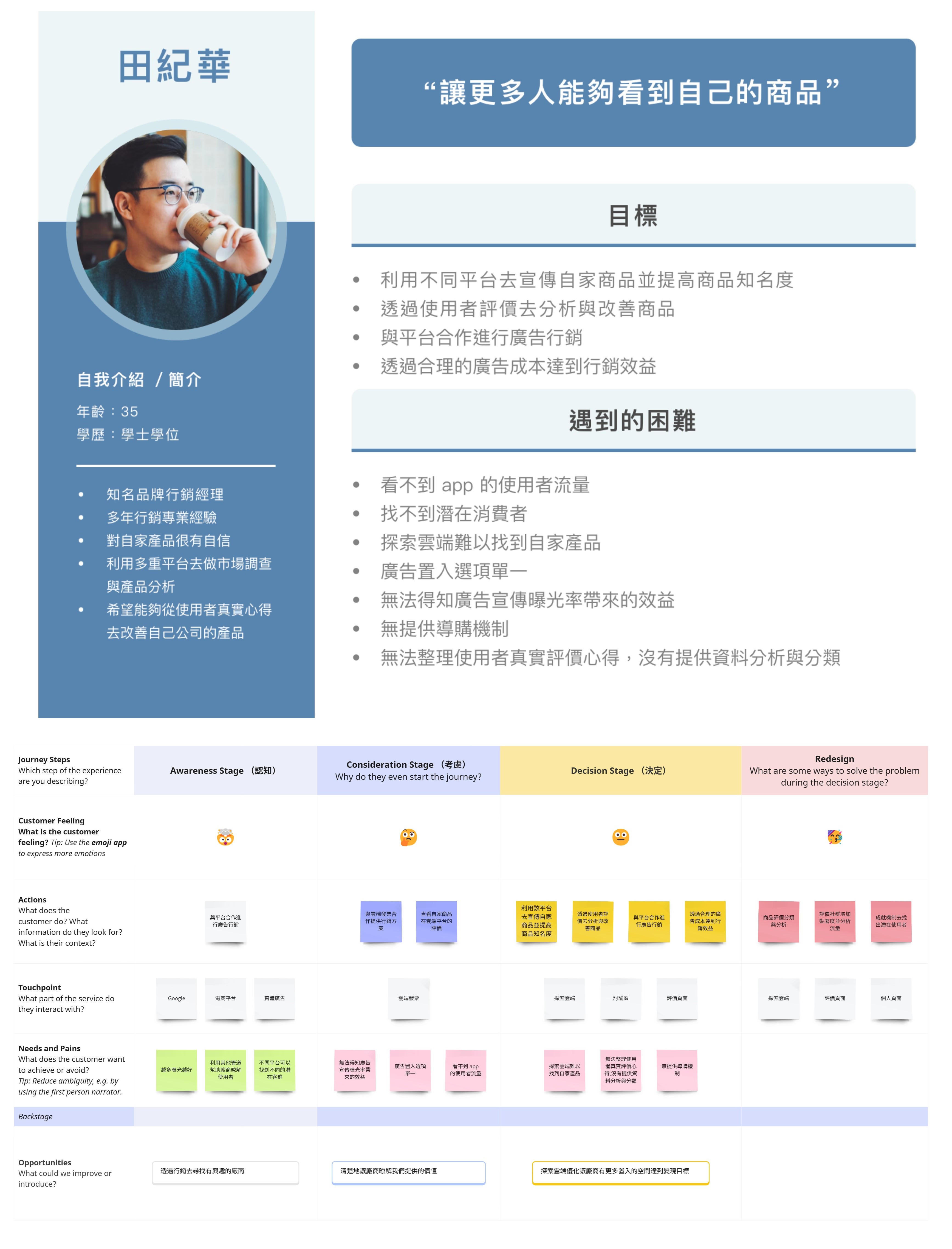
I developed three personae and mapped out their user journeys to effectively communicate with the engineering and marketing teams. This approach helps them gain a clear understanding of our user's goals and the pain points they encounter, ensuring we address the right issues and tailor our solutions to meet their needs.
The design team created a functional map and reviewed it with the engineering team to see the possibility of development on the new features.

We’ve started the redesign and broken the project into six clear stages. We’re using Scrum to keep things organized and make sure we finish on schedule. Each stage builds on the last, so we can make adjustments and improvements along the way. This approach helps us stay flexible and focused, ensuring we create a design that works well and meets our goals.