eCloudInvoice distinguishes itself from other electronic invoice applications with a unique feature that enables users to leave reviews based on their invoices, ensuring trustworthy feedback by minimizing biased sponsorships. However, after more than ten years, this feature has experienced a notable decline in usage.
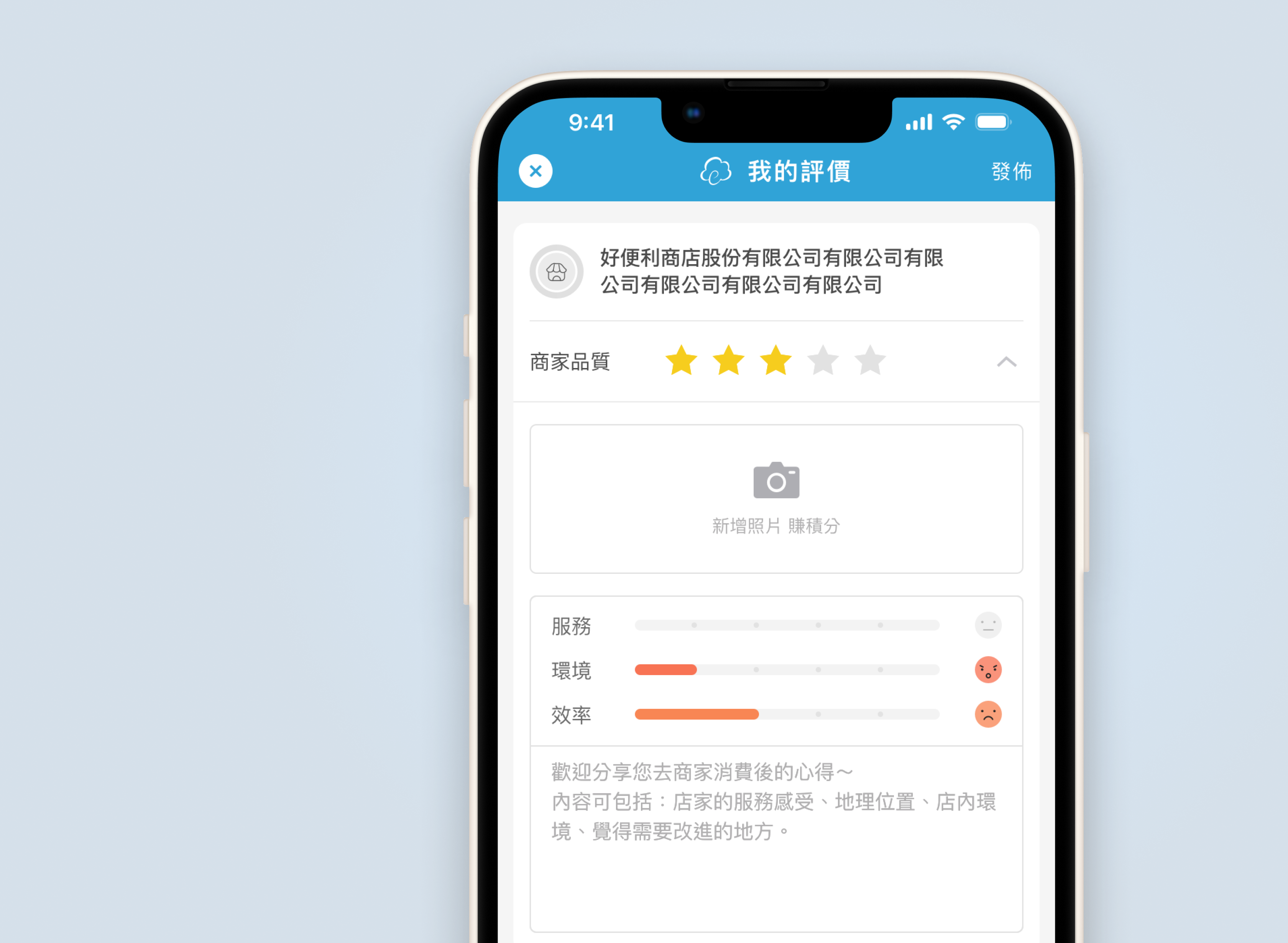
UI Design / UX Research
2023, May
We hypothesized that the current forum posed challenges for users during the writing process. Users struggled to perceive hierarchy and locate the entry point for submitting reviews, leading to decreased feature engagement. Additionally, another issue stemmed from the quality of reviews, which often lacked detailed sharings beyond a simple rating. This lack of context diminished the overall quality of the review forum.
In 2023, our primary objective was to monetize the application. Yet, during the initial planning phase, we were met with the challenge of understanding our users due to the diverse user groups within our application. We envision the redesign as a valuable opportunity to delve into user behaviour through their reviews. Therefore, one of our goals is to direct and guide users in creating qualitative reviews to provide better and more useful information for other users. The design faced challenges due to limitations in accessing invoice data from the database, which restricted the availability of detailed information needed for submitting reviews. As a result, reviews could only be submitted from the invoice page rather than within the forum. However, our main objective is to redesign the writing process to enhance clarity and usability for the user.
I am in charge of the design from researching to redesigning the existing invoice review writing process.
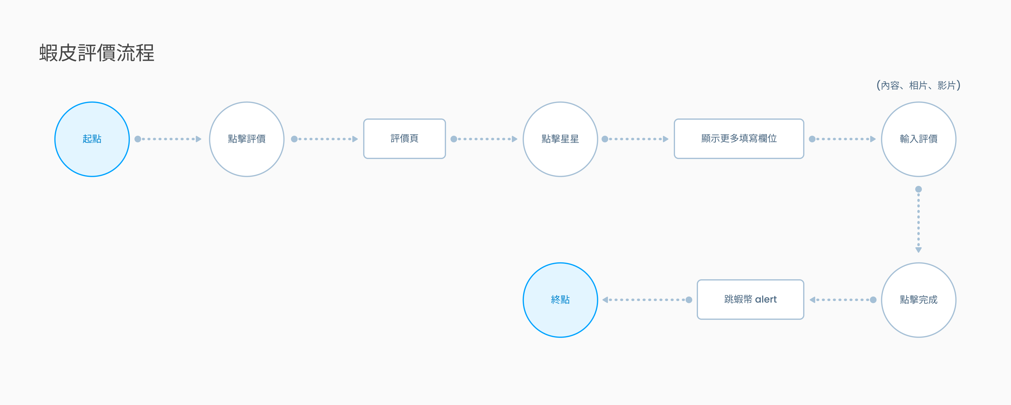
We analyzed competitive review forum applications to study the process of submitting invoice reviews.
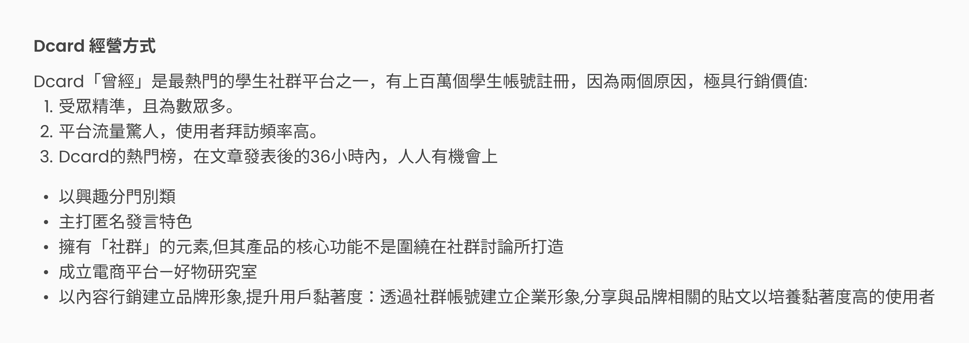

Flowcharts were created with the Product Manager to allow us the designers, to understand the process and the limitations and restrictions of the challenges. This helps designers visualize the overall structure and ensures no pages or steps are overlooked during the design phase.
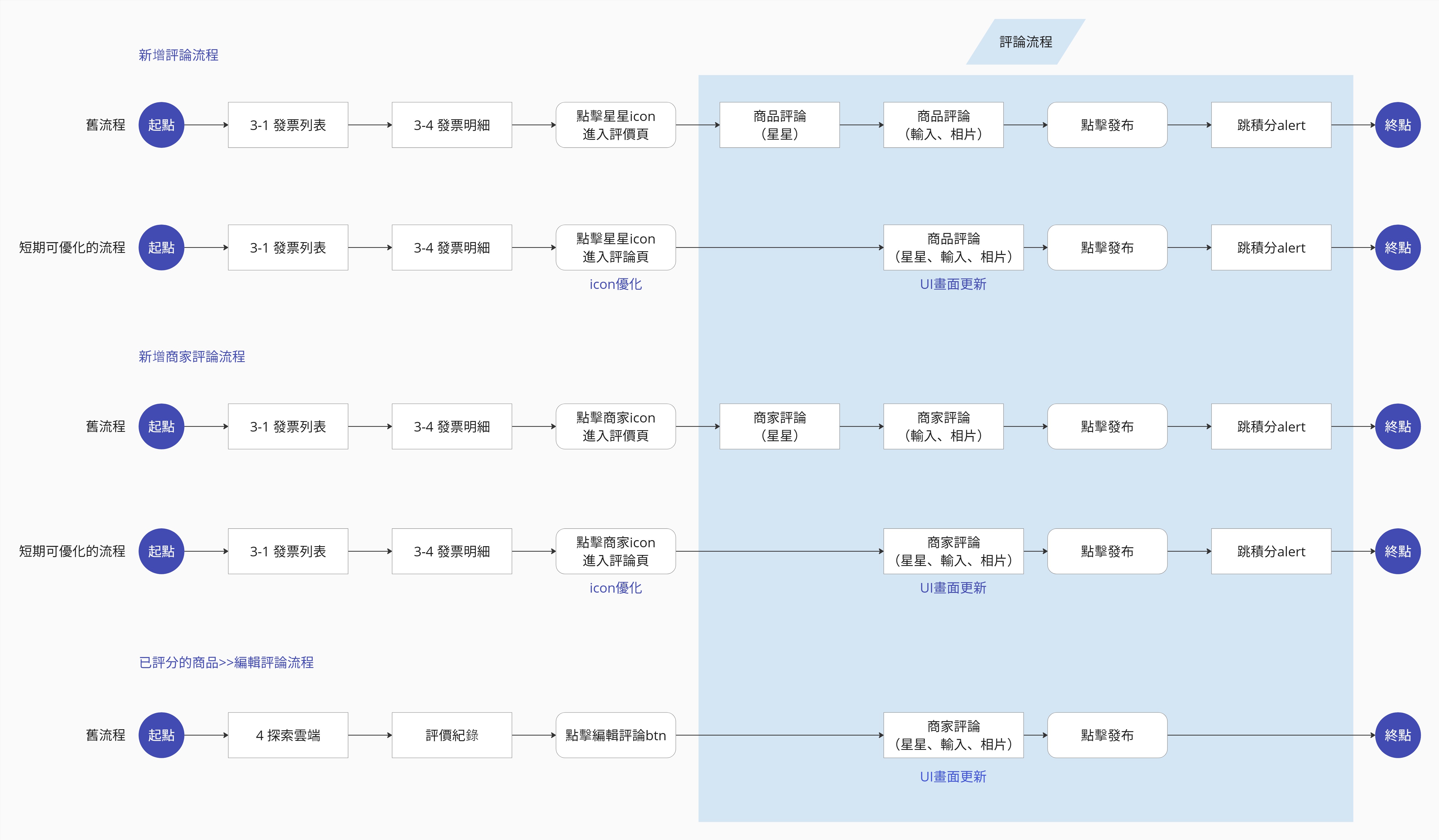
Considering the development constraints and project scope, the following requirements have been identified:
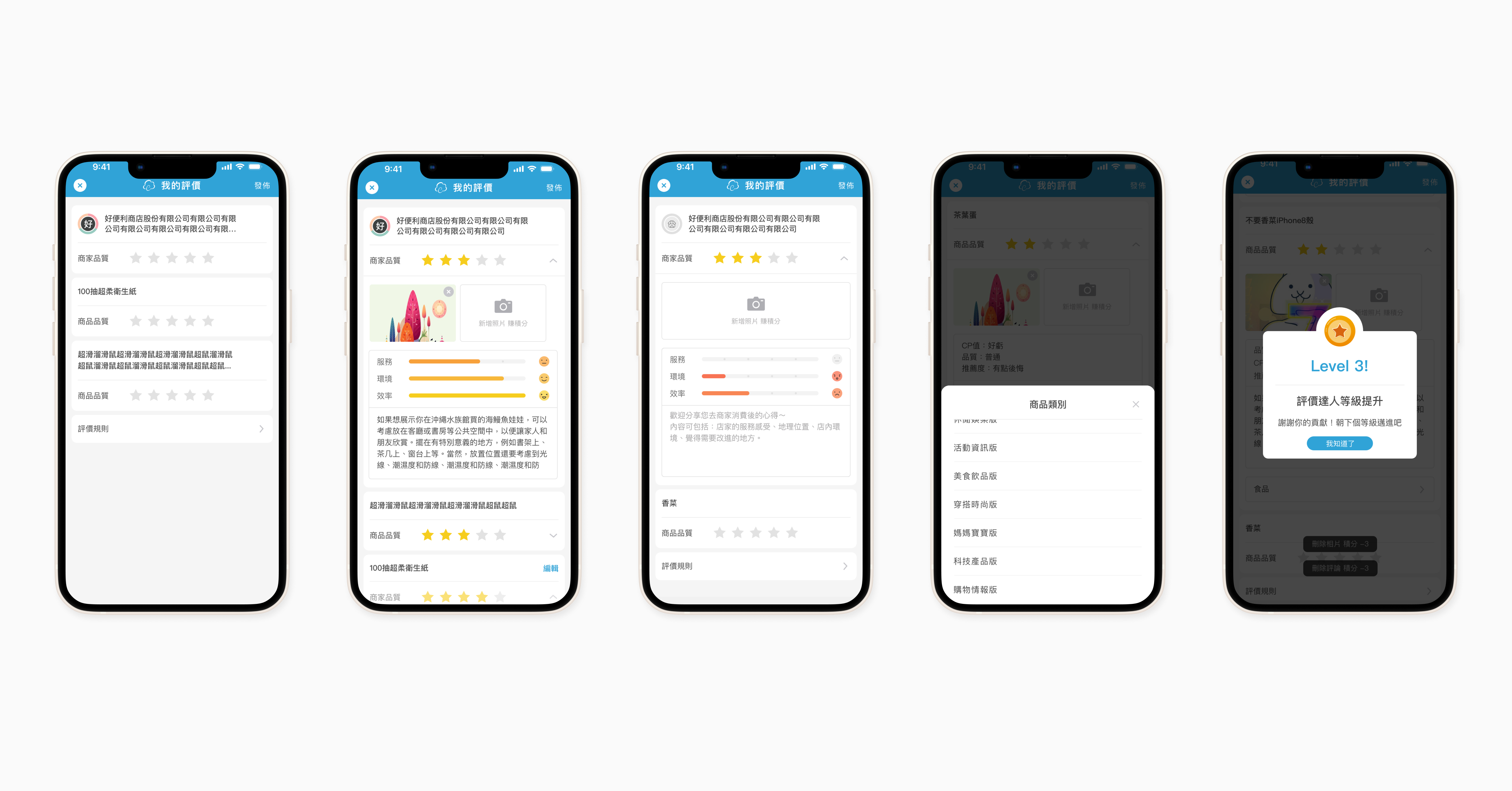
By leveraging our existing features and design capabilities, we crafted high-fidelity wireframes, which provide better options for communicating ideas with other team members compared to low-fidelity wireframes.
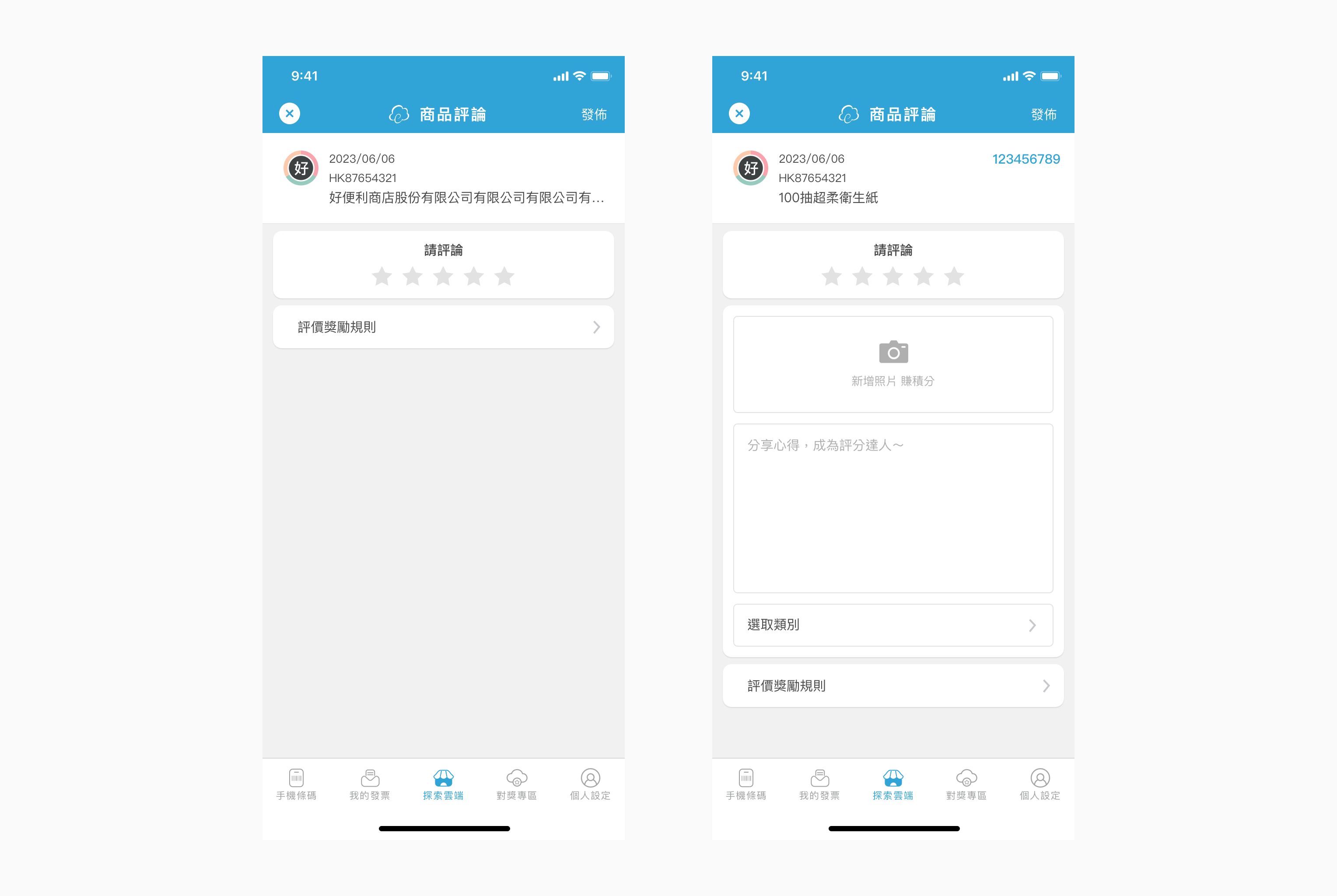
We conducted usability testing with team members who were tasked with submitting a review for a detailed invoice item. My fellow designers and I closely observed their process and the steps they took to achieve this goal. The focus of our observations during the usability test centred on the review submission process.
The marketing team has suggested incorporating quantitative options into the review write-up, which could enhance our ability to categorize consumer products more effectively in the future.
The final revision mockups were crafted using Sketch and uploaded to Zeplin for iOS, Android, and Web developers to inspect design specifications and download assets. On May 13th, 2023, the new review submission process and UI launched globally. Despite being a small-scale redesign, it marked our initial effort to understand our user groups and brought us closer to monetizing our application.
Comparing the statistics of invoice reviews submitted from March 13th, 2023, to April 13th, 2023, versus May 13th, 2023, to June 13th, 2023, we observed an 8.58% increase in review submissions. While the increase is not substantial, it suggests that the challenges affecting application usage do not stem from the usability of the review writing process.
Key takeaways from this project are: