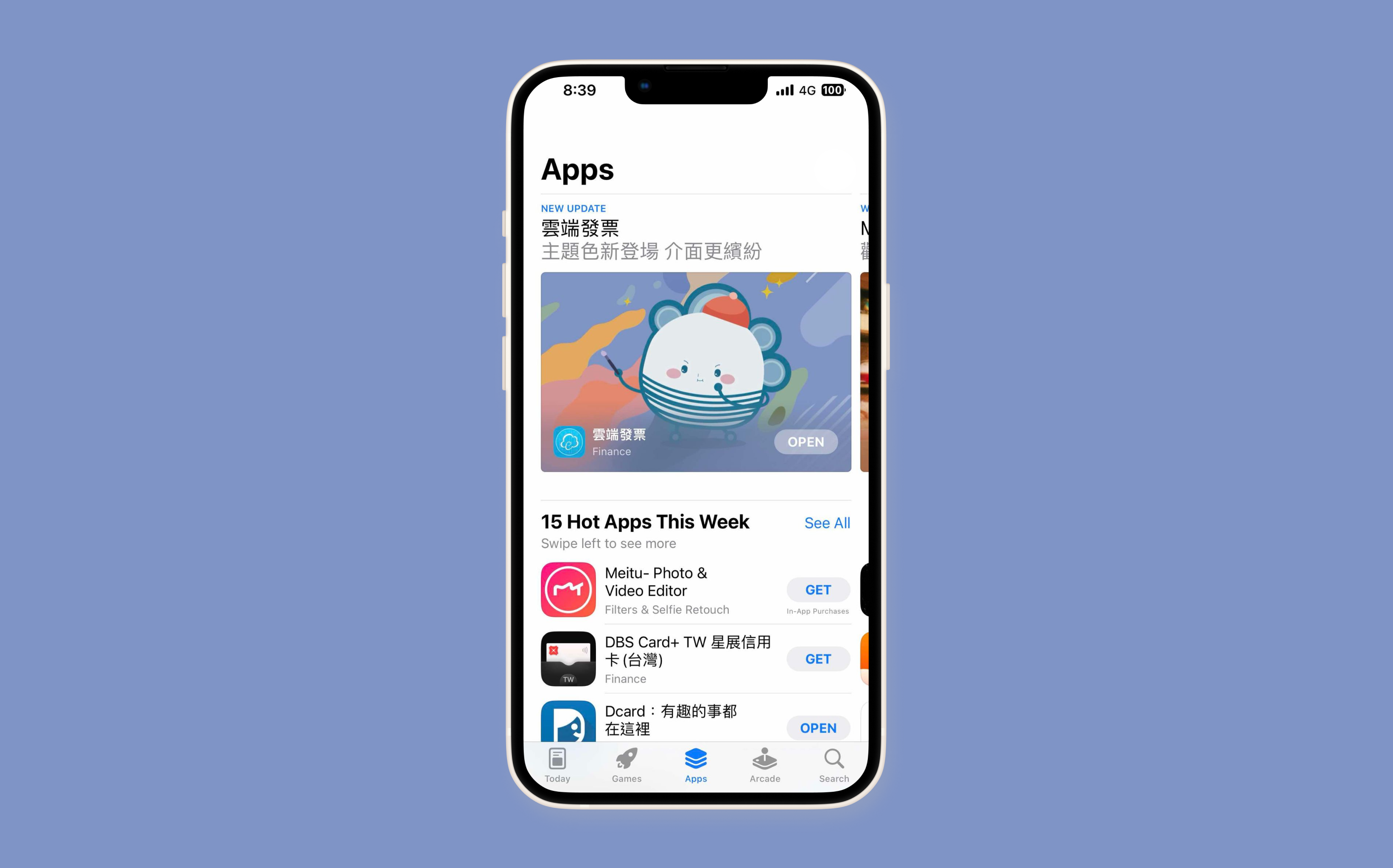
2023 was a year of significant transition for eCloudInvoice business. The company received its first revenue inside the application with the colour theme feature in July.
UI Design / UX Research
Graphic Design
2023, July
I led the design and planning of the in-app store purchase feature of eCloudInvoice across iOS, Android, and Web during the second quarter of 2023.
Consumer Research and Ideation
Planning and Defining Scope
Design Execution and Validation
Leadership
Our application had been decreasing in user usage during 2023. The application mainly focused on being a tool for scanning barcodes for invoices during purchases. With the design of the widget feature, the probability of users opening the application decreases.
Our user base spans diverse genders and age groups, presenting a challenge in understanding their needs and behaviours. Focusing on a specific demographic proved challenging as our user groups are widely spread apart. Our objective is to enhance app engagement without monetizing the product directly. We employed various strategic design approaches to analyze user behavior and needs, while also generating our initial application revenue.
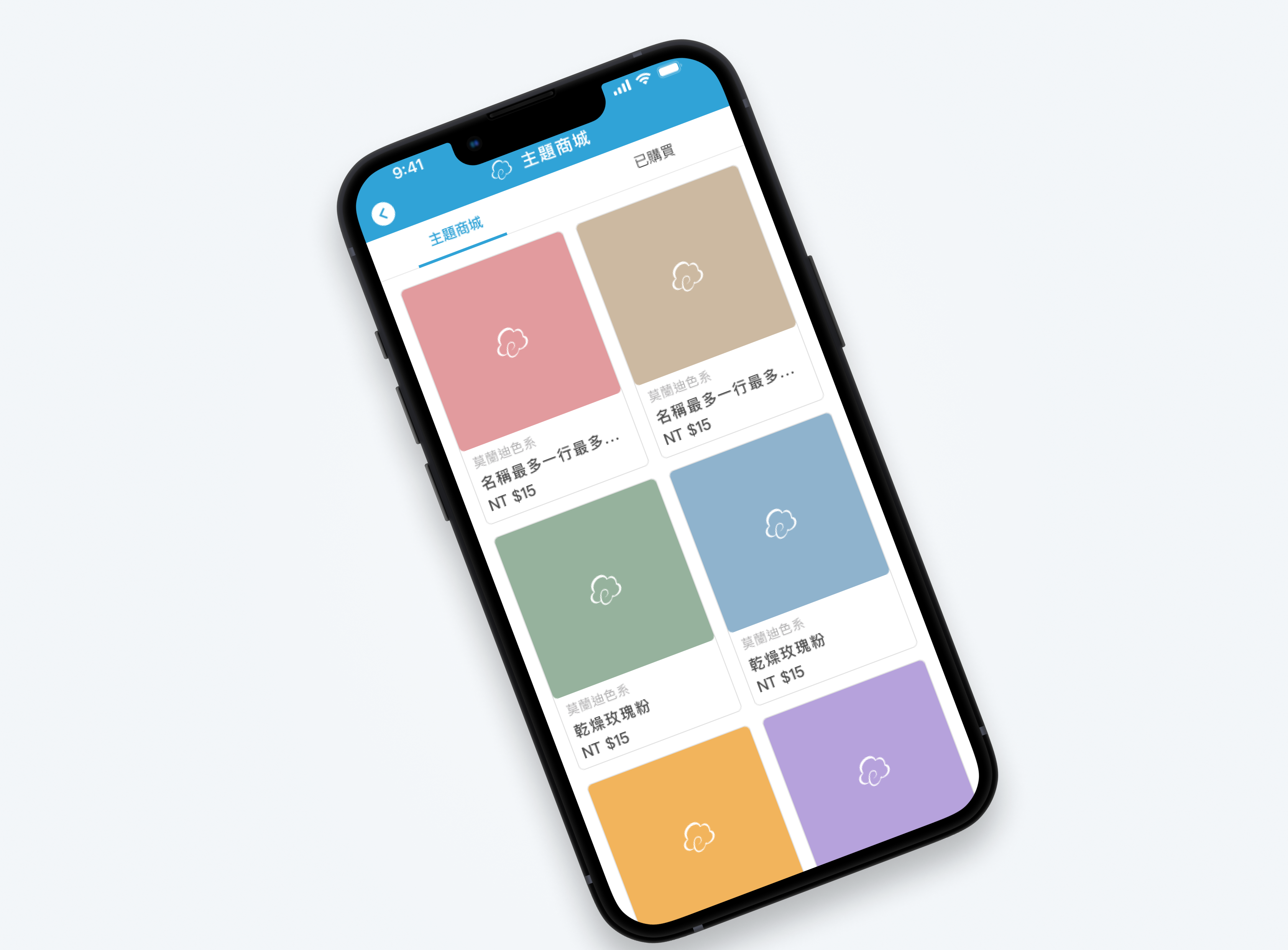
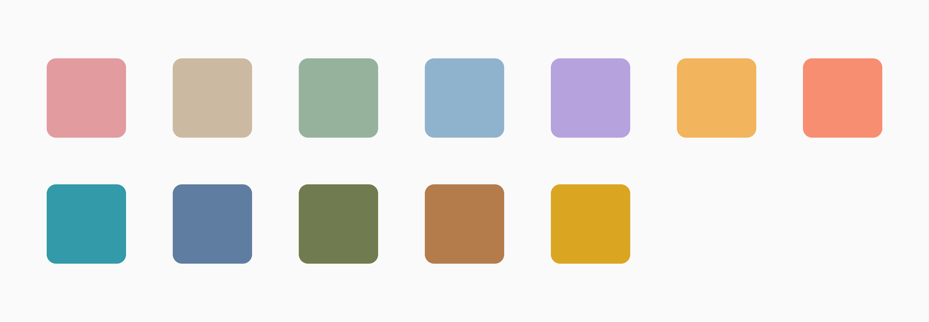
We went for a psychological approach in the gamification method without broadening our scope. We wanted to create an emotional bond between the application and the users, granting them greater freedom. This transformation aims to elevate the app from merely a tool to a personalized experience, ultimately increasing user engagement. Therefore, we planned to implement a colour theme feature that enables users to customize their application's primary colours according to their preferences.
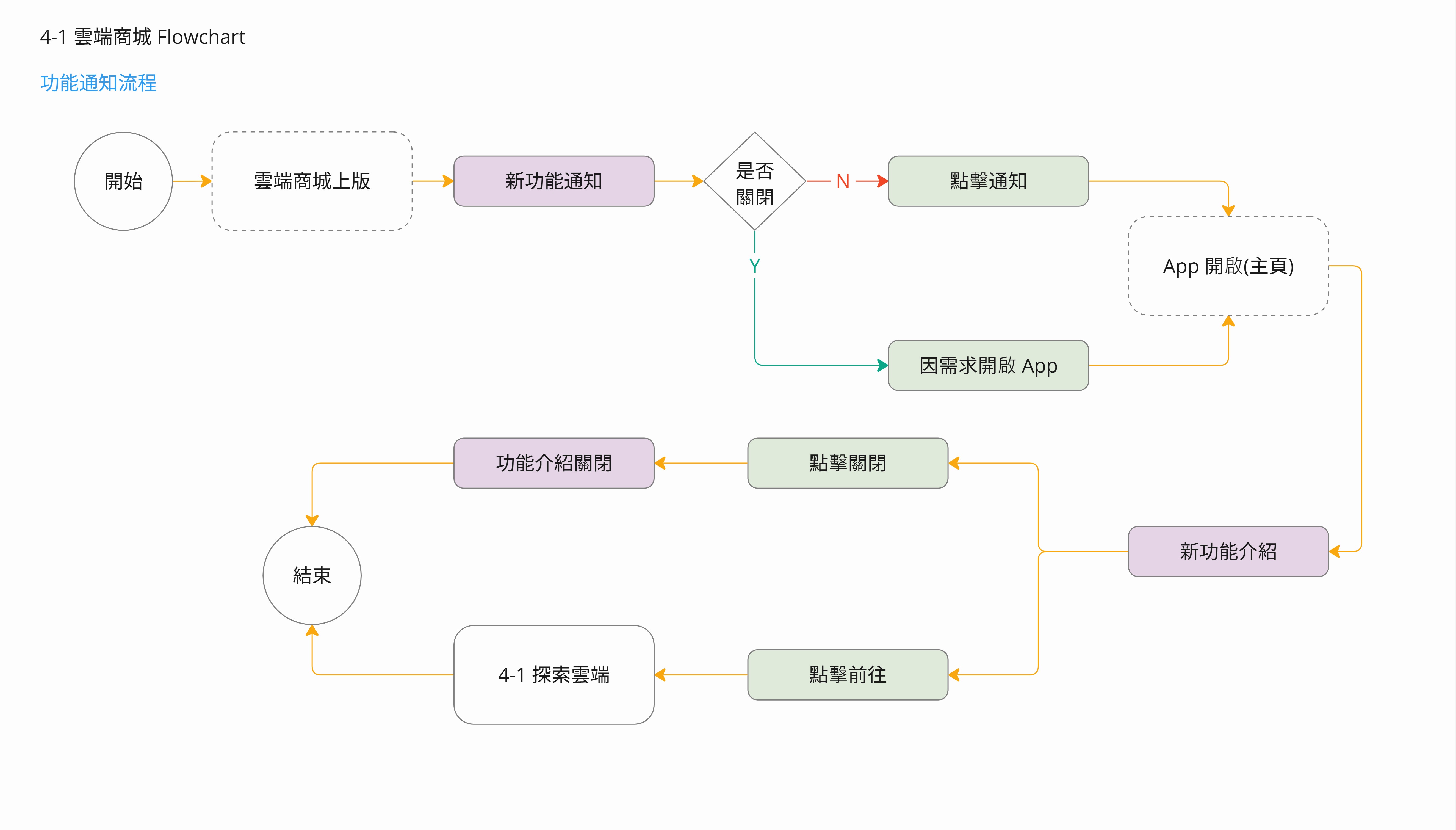
The first user flow is the process through notifications. Users will seamlessly enter the app through notifications, guiding them through the introduction of new features. This process ensures they can easily explore and engage with the latest updates immediately.
The second user flow focuses on how users engage with the new feature directly within the app. By navigating through the forum tab, users experience the new feature in various stages. This flow highlights the key interactions and touchpoints, ensuring a smooth and intuitive experience throughout their journey with the feature.
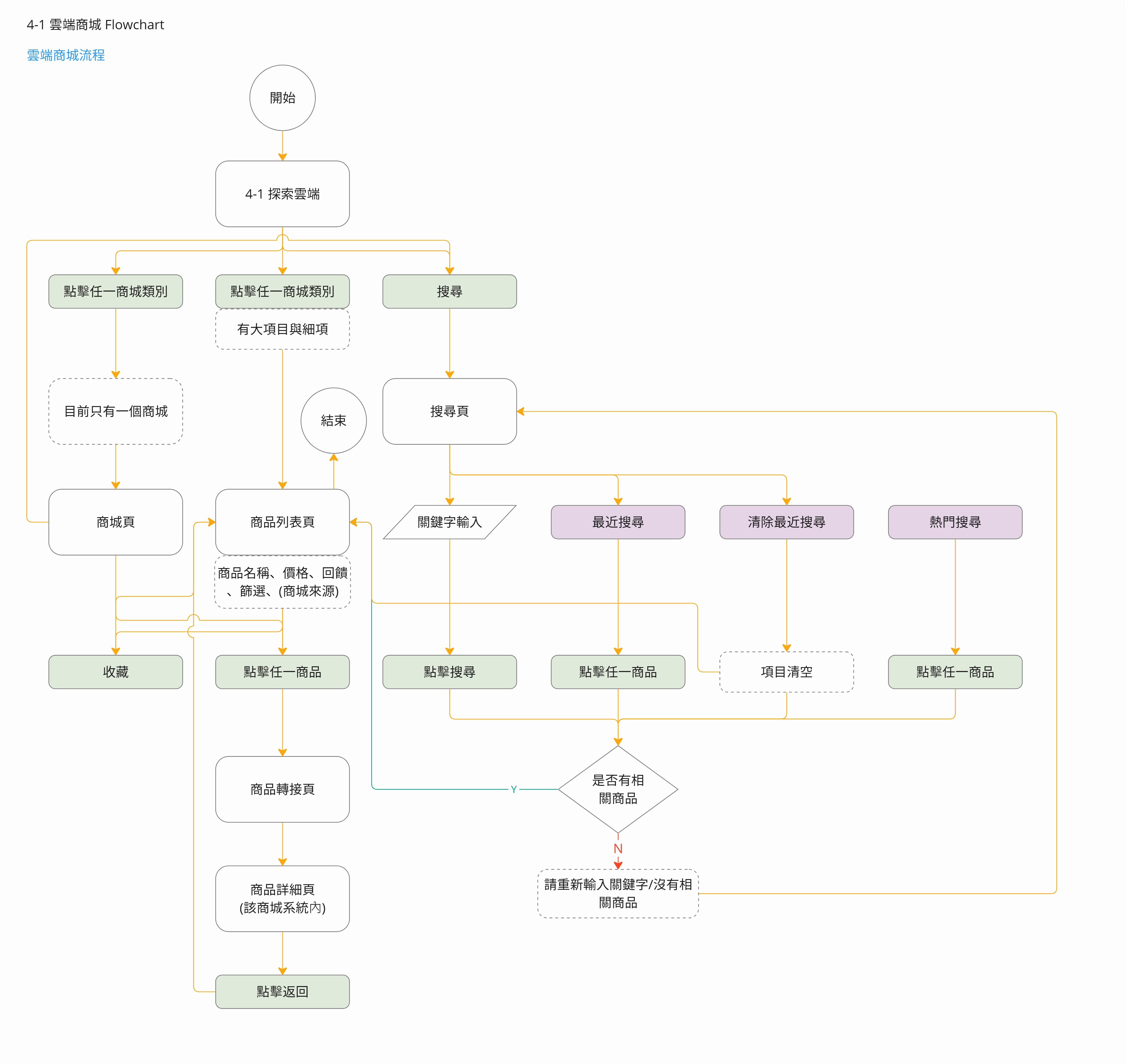
Based on the problem identified, there are a few potential requirements:
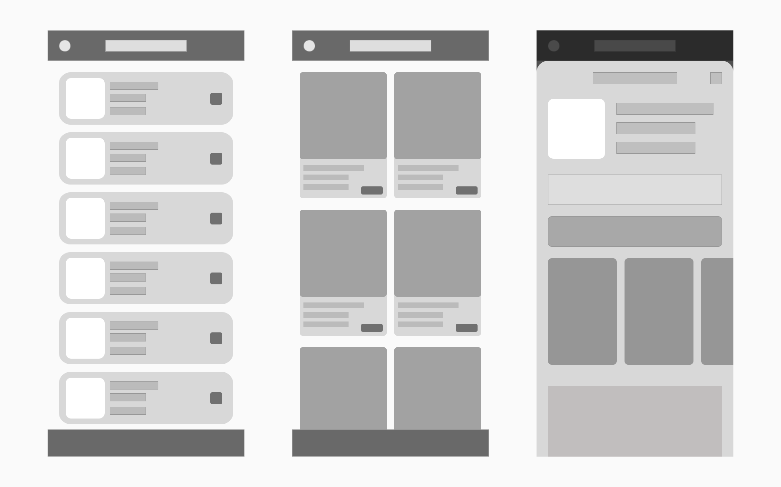
I conducted usability testing sessions with fellow designers and developers to validate the functionality and workflow of the store features. The observations during these sessions primarily centred around evaluating the clarity of the purchasing process steps and the visibility and hierarchy of the information.
The high-fidelity mockups were created using Sketch and then integrated into Zeplin for developers to review, allowing them to export icons and images as needed. The design team collaborated closely with the iOS and Android teams to review any missing interactions or design specifications before commencing development.
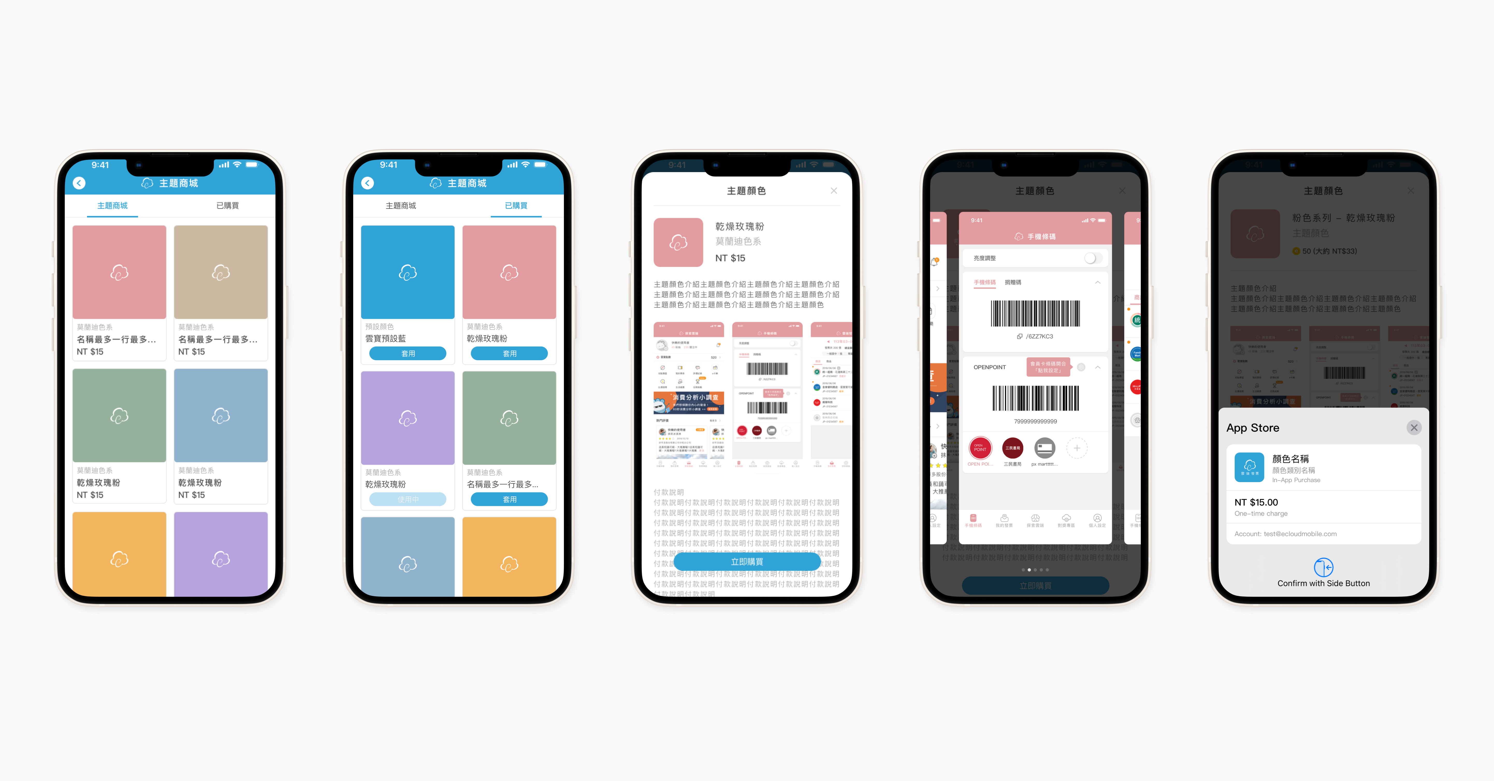
eCloudInvoice was awarded Apple's prestigious 'Application of the Week' in August 2023, particularly for its innovative colour themes feature. Comparing app usage statistics from June 18, 2023, to July 17, 2023, with July 18, 2023 (after the colour theme update) to August 18, 2023, we observed a significant 16.1% increase in application usage.
Key takeaways from this project are:
